STEM 7.4 was released on 08 December 2014.
The features of this new version have been outlined in earlier articles, but some of
the new extensions warrant a closer look now that the actual software is out there.
Much has been made of the ‘solution to the right-click problem’, and
our early adopters are now gradually adapting to the simpler and more intuitive
approach for accessing time-series parameters when required (rather than all too
often by mistake as before). In this article we are going to play a small fanfare
for the new Find function, and also take a closer
look at some subtle but very satisfying changes to the way that charts are presented
in the Results program and on the web.
Navigation in an unfamiliar and/or large model
The models we show in training or demonstration examples are typically small enough
to fit on one screen to minimise unnecessary scrolling in a learning context. The
reality is that many models accommodate disparate markets and service types, expand
to cover multiple network functions, aggregation levels, and sometimes technology
variants, and typically evolve to consider installation labour, power, rack and
office space across many of the original network resources.
In practice therefore, even the most modest view will outgrow the limited confines
of the screen (especially when working away from the desk on a laptop or tablet
screen), and for reasons of convenience and modularity, it will make sense to break
up a model into separate views for ease of navigation. It is also common to include
additional views which allow for different perspectives on some of the same elements;
for example:
- a high-level summary view showing the principal elements and drivers
- a summary of the scenario structure showing only the affected elements, removed
from their original context
- a collection hierarchy showing how costs are grouped, again separated for clarity
from the original dimensioning context.
For all of these reasons, it may not be immediately apparent where to find a particular
element you need to review or edit, or even in which view (or views) to look. After
some time away, this can easily be an issue with a model you have developed yourself,
and it is more frequently an issue if the model was built by a colleague. (The latter
context is how you have to imagine our support staff working most of the time!)
So, the principal reason for adding the new Find
function is to help you locate and swiftly access an element by name (or sub-string
match). The fact that you can also search for text in view names, text boxes, formulae,
values and notes is almost an afterthought!
At its simplest, the process to locate an element called DSL
access is as follows:
- Press <Ctrl+F>. The Find dialog is displayed.
- Enter the name, DSL access (or as many characters
as required to get a close match), and press <Enter>. The dialog immediately
lists every matching element (and view name and text box) and the first match in
the current view is highlighted.
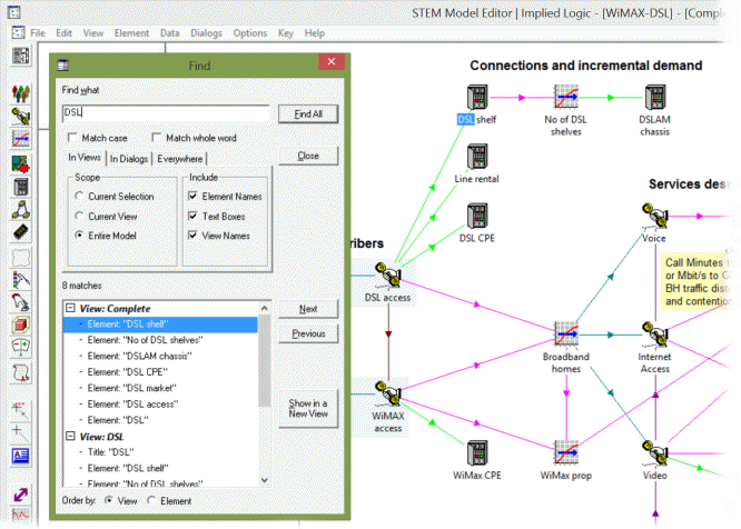
Figure 1: the first matching element is selected in the current view
- Press the Next button to highlight the next match.
To minimise jumping about between views, by default the sequence will progress across
and down the current view (and then from the top-left back to where you started),
and then in the same manner through other views with matching content in turn. (You
can group the list by element if you prefer.)
- Alternatively, if you can see what you want in the list already, you can double-click
it to go straight to that item in the relevant view.
- For audit and review purposes, you can also pick several elements in the list and
click Show in a New View to display just these
elements in a new view which you may or may not choose to discard after a specific
check is complete.
It is easy to get distracted by the wealth of options for how and what to find,
and the difference between searching in views or data dialogs (or both), but the
principal benefit is to not waste time finding or even scrolling to that elusive
DSL access! If you are interested in all the other
stuff, then just press <F1> in the Find dialog
to
access the help system where the options and commands are explained in full.
The obvious extension to support a selective Find
and Replace is already in the works; we just have
to figure out the best remedy for when a modified element name would be no longer
unique, or a modified formula would have broken syntax!
How to label line and column charts
“At the risk of stating the obvious, the x-axis labels on a time-series chart show
the periods associated with each of the values shown on the chart. On a column chart,
the labels are positioned mid-column; on a line chart (for the overwhelming majority
of end-of period results) the labels follow the data points (up to the end of the
chart).”
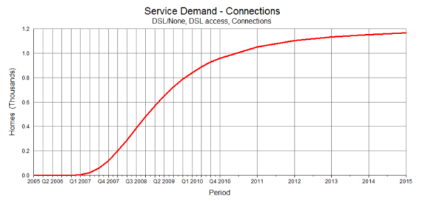
Figure 2: a chart displayed by STEM 7.3
Not any more! (Never be scared to think the unthinkable.)
In earlier versions of STEM, a chart would show vertical gridlines for all periods
by default in order to highlight, particularly on a line chart, when results for
quarters or months were available. These gridlines were all classed as ‘major’.
When developing equivalent charting functionality for business models on the web
with eSTEM, it became apparent that it was unnecessary to display labels for individual
quarters and months when these could be inferred readily from the corresponding
year labels. The overall presentation is much clearer without the plethora of over-long
sub-annual labels like Q1 2015 and Q2 2015 all competing for space!
So, we decided to carry this logic over into the C-STEM Results program and suppress
the sub-annual period labels there too. We also re-invented the sub-annual vertical
gridlines as ‘minor’ in order to differentiate them from the major gridlines
for years. In short, the minor gridlines are drawn with a lighter shade of grey
so that, in a non-intrusive way, the years stand out more clearly.
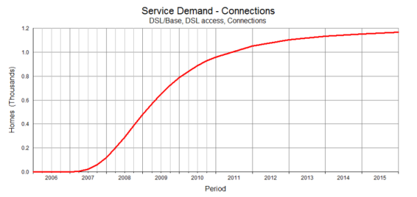
Figure 3: the equivalent chart displayed by STEM 7.4
For a column chart, when you have four columns for successive quarters in a year,
it is not hard to see that the year label should appear midway between the four
columns, exactly where it will be if you switch to showing consolidated annual values
and the four original columns are replaced by a single column for the year.
On a line chart showing only annual values (e.g., end-of-period connections), we
would originally have shown the year label under the value, even though you might
regard ‘the year’ as being everything between the previous end-of-year
value and the next. This becomes more apparent when you add quarterly values and
so now we place the year label ‘mid-year’, which will be under the (end
of) Q2 value if quarterly values are shown.
This may sound convoluted, but in simpler terms it also means that the year labels
will now come between the major grid lines which mark the ends of each year. It
also means that Y0 will not be shown on a line chart anymore because the first label
will be Y1 under the portion of the chart which shows the evolution of the data
in from the end of Y0 to Y1. This, in turn, nicely meshes with the separate decision
to suppress Y0 data on column charts by default. (Typically one is only interested
in the movements, revenues and costs from the beginning of Y1 onwards, and in Y0
only as a starting position for line charts.)
Note: if you think there must be occasions when it would be helpful to show quarterly
or even monthly period labels, then yes, you are right! STEM will display months
if a model runs for only one year in months, and quarters if it runs for only two
years. The rationale is not more than around ten period labels on the chart, and
only eight for a run period longer than one year because then the individual labels
have to include the year too!
In fact, we have substantially re-invented much of the presentation logic for charts
in the results program, making it far easier to develop and apply a style to an
entire view or workspace, and also to work with colours from a custom palette. Most
of this is pretty self-explanatory and will be intuitive as you work with it. Again,
you can
click through to the online help to read more of the details.
STEM 7.4a already
It had to happen. Customers find things we don’t. This is a fact of life,
making the first point release for 7.4 as inevitable as a SP1 for any other software
product. A number of minor irritations and cosmetic errors have been identified
and will be addressed by a STEM 7.4a release in February 2015 which will be notified
directly to recent users as soon as it is ready.