 The STEM network investment modelling software is a
powerful and complex tool backed by a comprehensive programme of training and support.
Once a core competence has been established, it is often desirable to distribute
results to colleagues and even customers who may then engage in the refinement of
scenarios. The D-STEM (distributable) and especially eSTEM (Web-based) publishing
models do not require any specific knowledge of STEM, but this wider audience may
soon demand it! This one-hour introduction is being developed as a companion guide
aimed at the infrequent or peripheral user.
The STEM network investment modelling software is a
powerful and complex tool backed by a comprehensive programme of training and support.
Once a core competence has been established, it is often desirable to distribute
results to colleagues and even customers who may then engage in the refinement of
scenarios. The D-STEM (distributable) and especially eSTEM (Web-based) publishing
models do not require any specific knowledge of STEM, but this wider audience may
soon demand it! This one-hour introduction is being developed as a companion guide
aimed at the infrequent or peripheral user.
Fundamental links between revenue and cost
Models are presented in the STEM Model Editor, where each element of a business
plan appears as an icon. The arrows linking these elements automatically reflect
the dependencies and other relationships in the business and these links reveal
the high-level logic. The best way to get a quick feel for a model is to hover over
various icons, looking at the floating summaries of related assumptions which then
appear.
 First, look for the Service elements – these are the sources of revenue from the
various services offered to customers, such as residential telephony, dial-up Internet
and so on. Here you can look into demand assumptions – relevant
market penetration, calling volumes and busy-hour traffic calculation (or nominal
data rate and volume calculation for data services) – and tariffs
– connection, flat-rate rental and usage/metered.
First, look for the Service elements – these are the sources of revenue from the
various services offered to customers, such as residential telephony, dial-up Internet
and so on. Here you can look into demand assumptions – relevant
market penetration, calling volumes and busy-hour traffic calculation (or nominal
data rate and volume calculation for data services) – and tariffs
– connection, flat-rate rental and usage/metered.
 Then look for Resource elements – these represent the direct and indirect costs
incurred in the provision of services, from core and line hardware components through
to software and spectrum licences, buildings, vehicles, personnel and other administration
costs. Here you will find planning dimensions – unit capacity for
demand, maximum utilisation, mean replacement lifetime, depreciation rate and period
– and unit cost assumptions – capex and maintenance or fixed and
variable lease costs.
Then look for Resource elements – these represent the direct and indirect costs
incurred in the provision of services, from core and line hardware components through
to software and spectrum licences, buildings, vehicles, personnel and other administration
costs. Here you will find planning dimensions – unit capacity for
demand, maximum utilisation, mean replacement lifetime, depreciation rate and period
– and unit cost assumptions – capex and maintenance or fixed and
variable lease costs.
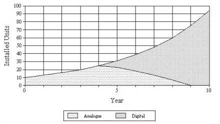
A green arrow denotes a requirement for a Resource by a Service:
double-click to review the basis for this mapping – connections, busy-hour traffic,
volume or revenue.
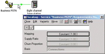
The Requirement dialog for an individual Resource shows that this demand is mapped
on the basis of Connections
Right-click an icon to access the associated inputs from a menu. You will find many
time-series buttons in the various input forms or ‘data dialogs’:
these buttons show a summary of the data and accept constants or formulae. Click
the button to enter parameters for exponential growth, S-curve or interpolated-series
inputs, which may be previewed via the graph button on the dialog menu. Alternatively,
the time-series button expands the assumptions to show the implied values for each
period of the model run.
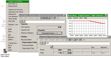
Accessing time-series inputs from an icon menu
In order to access the results, select Run from the File menu or just press <F5>.
The model will be run if the inputs have been changed, and then the results are
loaded into the STEM Results program.
A selection of charts and tables may be restored from a previous
session (workspace), with optional additional screens accessed from the View menu.
Exploring the full range of available results is easy:
- Select Draw… from the Graphs menu. The Draw Graphs dialog is displayed, with a list
of graphs ordered by type of element, such as Service, Resource or Network.
- Select Network NPV, for example, and click OK. The NPV result is charted as a time-series
in a new graph window.
- If multiple scenarios have been run, then you will be prompted to select some or
all of these for the graph, or to appear on separate graphs.
Drawing a graph for Services or Resources requires on extra step:
- First select the desired graph as above, e.g. Service Revenue. After you have clicked
OK (and selected the desired scenario, if applicable), then the Choose Elements
to Draw dialog is displayed, with a list of the Service elements defined by the
modeller.
- Again, select some or all of these for the graph, or to appear on separate graphs.
By default, a line graph is drawn, but you can readily change this by selecting
Format Graph… from the Format menu, or by right-clicking directly on the graph.
If you have selected all Services, it may be instructive to use a stacked column
format for a breakdown of network revenues (and similarly for charts of Resource
costs). Select Show Graph as Table to view the underlying numerical data.
A closer look at how elements fit together
Returning to the STEM Model Editor – select Editor from the STEM menu in the Results
program, or just press <Alt + Tab> – you may also be able to explore the modeller's
preferred views of the structure. As soon as a model outgrows a single screen, it
may be separated into multiple views for market analysis, CPE,
local loop or radio network, backhaul, switching, transmission, management, administrative
costs and so on. Common elements may have icons in more than one view, each bound
to the same core data.
 You will notice many Transformation elements – these provide a range of built-in
calculations, such as Erlang B and time-lag, plus user-defined expressions (or formulae)
which combine the results of input elements at run-time. A Transformation is defined,
first by its inputs – look for the pink links – and then by the type and related
parameters or formulae as defined in the Input and Transformation dialog (icon menu).
For each input, a suitable basis is selected, such as Installed Units or Used Capacity
of a Resource. These identify the specific results which will drive the calculation
at run-time.
You will notice many Transformation elements – these provide a range of built-in
calculations, such as Erlang B and time-lag, plus user-defined expressions (or formulae)
which combine the results of input elements at run-time. A Transformation is defined,
first by its inputs – look for the pink links – and then by the type and related
parameters or formulae as defined in the Input and Transformation dialog (icon menu).
For each input, a suitable basis is selected, such as Installed Units or Used Capacity
of a Resource. These identify the specific results which will drive the calculation
at run-time.
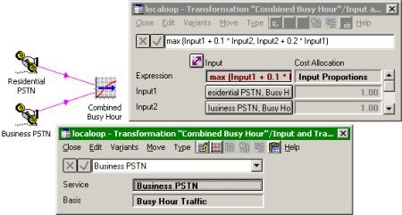
Transformations act on specified results (input basis) at run-time
 Services may be linked to optional Market Segment elements which simply identify
a common time-series assumption for a range of Services (and specific tariffs) offered
to the same group of potential subscribers. STEM automatically
aggregates related Service revenues and costs for these elements.
Services may be linked to optional Market Segment elements which simply identify
a common time-series assumption for a range of Services (and specific tariffs) offered
to the same group of potential subscribers. STEM automatically
aggregates related Service revenues and costs for these elements.
 Many Resources are linked to optional Location elements which define the geographical
spread of demand in terms of the number of separate sites where a given
Resource must be deployed. The Deployment dialog provides a pragmatic model for
the general distribution or variance of this demand, for macro-economic analyses
where it is either unnecessary or impractical to model each site individually. (Template
replication, described later, provides a manageable solution for detailed per-site
modelling.)
Many Resources are linked to optional Location elements which define the geographical
spread of demand in terms of the number of separate sites where a given
Resource must be deployed. The Deployment dialog provides a pragmatic model for
the general distribution or variance of this demand, for macro-economic analyses
where it is either unnecessary or impractical to model each site individually. (Template
replication, described later, provides a manageable solution for detailed per-site
modelling.)
Global options are selected from the Data menu. The Run Period defines the model
start date and time-frame, plus optional quarters and months for
the initial years. Financial settings include the currency unit, tax and interest
rates, and gearing assumptions for the balance sheet.
 The scenario space for a model is framed by one or more Dimension elements, each
of which identifies a number of input parameters which vary across scenarios.
The scenario space for a model is framed by one or more Dimension elements, each
of which identifies a number of input parameters which vary across scenarios.
 A Variant element then defines one coherent set of values
for the specific parameters associated with a particular Dimension. (Select
Variant Data from the Dimension icon menu to access a table comparing the alternative
values for its parameters.)
A Variant element then defines one coherent set of values
for the specific parameters associated with a particular Dimension. (Select
Variant Data from the Dimension icon menu to access a table comparing the alternative
values for its parameters.)
An individual scenario is generated from the core (working) model by copying Variant
Data from one specific Variant for each Dimension in turn. Select Scenarios from
the File menu (or press <Shift + F5>) to select and run some or all of the
available scenarios, and (optionally) the working model. The Results program automatically
offers a selection of up-to-date scenario results when drawing graphs after one
or more scenarios have been run. Select All Scenarios on One Graph to compare results
such as NPV.
All of the input data are checked for certain bounds and consistency when a model
is run. If any errors are found, these are immediately highlighted in the Editor.
Select Next Error from the File menu to step through and fix multiple errors before
running the model again.
 The
modeller may have linked certain groups of Services or Resources into Collection
elements – these are used to calculate aggregate results and also provide a tabular
interface for the associated input data from the Collection icon menu. Multiple
aggregation hierarchies may be created by nesting or overlapping
Collections. When drawing graphs of Service or Resource results, you will notice
that the names of relevant Collections appear in the Choose Elements to Draw dialog,
prefixed with asterisks (‘*’). For example, a stacked column chart may be used to
provide a categorised breakdown of Resource costs by Collections such as ‘Network’,
‘Personnel’ and so on.
The
modeller may have linked certain groups of Services or Resources into Collection
elements – these are used to calculate aggregate results and also provide a tabular
interface for the associated input data from the Collection icon menu. Multiple
aggregation hierarchies may be created by nesting or overlapping
Collections. When drawing graphs of Service or Resource results, you will notice
that the names of relevant Collections appear in the Choose Elements to Draw dialog,
prefixed with asterisks (‘*’). For example, a stacked column chart may be used to
provide a categorised breakdown of Resource costs by Collections such as ‘Network’,
‘Personnel’ and so on.
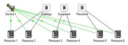
Collections are used to group elements and to calculate aggregate results
Technology substitution, geographical replication and auditing
 STEM
has a special grouping mechanism for functionally equivalent Resources – a Function
element indicates that expiring capacity of one Resource may be replaced with capacity
of another Resource in the same Function if the requirements of a particular Service
change over time, e.g. install latest technology once it is available. The pace
of such a migration may be accelerated if the original requirement
(double click the green link) has a non-zero Churn Proportion after a certain time.
STEM
has a special grouping mechanism for functionally equivalent Resources – a Function
element indicates that expiring capacity of one Resource may be replaced with capacity
of another Resource in the same Function if the requirements of a particular Service
change over time, e.g. install latest technology once it is available. The pace
of such a migration may be accelerated if the original requirement
(double click the green link) has a non-zero Churn Proportion after a certain time.
New technology replaces expiring capacity of another Resource in the same Function
 Individual
Resources may also be associated with Cost Index elements – these represent separate
cost trends which combine to form a composite capital cost trend
as defined in the Resource Capital Cost structure dialog (icon menu).
Individual
Resources may also be associated with Cost Index elements – these represent separate
cost trends which combine to form a composite capital cost trend
as defined in the Resource Capital Cost structure dialog (icon menu).
You can press <F1> in any of the input forms or data dialogs mentioned above
in order to find more information in the online help.
 At
the bottom of the toolbar you will notice the Template button – these elements are
used occasionally in large models when significant calculation structure must be
repeated, perhaps to perform separate regional calculations. Rather
like a Dimension, a Template has a number of associated Variants which provide differing
values for key parameters identified by the Template, which also identifies which
elements should be replicated.
At
the bottom of the toolbar you will notice the Template button – these elements are
used occasionally in large models when significant calculation structure must be
repeated, perhaps to perform separate regional calculations. Rather
like a Dimension, a Template has a number of associated Variants which provide differing
values for key parameters identified by the Template, which also identifies which
elements should be replicated.
In order to run such a model, STEM first generates an expanded model with one replica
per Variant, with respective Variant Data applied where appropriate. Then the expanded
model is run, generating results for each individual template replica, plus aggregate
results (over all replicas) from automatically created Collections which replace
the original template elements. Press <Ctrl+F5> in the Editor to preview the
structure of the expanded model.
Aggregate results are generated by automatically created Collections which replace
the original template elements
This replication process is non-destructive, so future changes
in structure will propagate automatically across all replicas whenever the model
is run, in the most striking example of how STEM manages the complexity inherent
in all detailed whole-network cost models.