This article is adapted from some real-life training experiences and focuses
on solutions to two specific modelling challenges related to ring networks
which hopefully exhibit a more general way of thinking about the building blocks which STEM offers.
Fibre rings are a ubiquitous feature of broadband networks and therefore feature
prominently in planning and cost modelling exercises. The future evolution and associated
investment impact of required capacity must be calculated from best-estimate demand
forecasts in conjunction with practical considerations about the exact topology
of the network. Inexperienced modellers may shy away from such details in a business-planning
activity for the simple reason of not being able to bridge the gap between lack
of detailed data and apparent complexity of the problem.
In fact there are well-established techniques for estimating the so-called ‘geographical
overhead’ of such topologies without ever ‘drawing a map’, and we routinely coach
clients through the required methodology. The text below includes a live presentation
of one version of the model where you can run the model on our server directly from a
Flash object embedded in this web page!
It’s not where you are, but how you are connected
A ring network at its most basic simply means a number of nodes connected by a single
path which traverses all nodes and then comes back on itself, topologically equivalent
to a circle – hence the name. Any two nodes are connected in two ways, one way or
the other around the ring (‘East’ or ‘West’ in the networking vernacular), which
means that no route is immediately blocked if any single link fails, assuming that
the network can dynamically route traffic one way or the other.
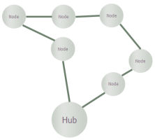
Figure 1: A ring structure provides natural resilience against individual link failures
In practice, complete networks comprise multiple, interconnected rings, either as
peers in a distributed network, or in an aggregation hierarchy. More generally,
some ring sections may be connected to mesh or hub and spoke network configurations
at other levels in a network. Unfortunately there are as many exact modelling techniques
as there are distinct configurations, and there can be no substitute for understanding
the network connectivity rules before you can begin to model it. However, there
are some general techniques which may be applied at any level, and an important
observation: if you already have dark fibre in the ground, then the dominant cost
of increasing capacity in the network is simply in the switching throughput and
optical interfaces. The distances and physical path in between are almost immaterial
– which is why you really don’t need a map … even if it would be a cool application
for that GPS device on your phone!
We are going to focus on just one level within a metro-network aggregation scenario.
Consider the market of business and residential Internet users in the vicinity of
a large town or city which already has the benefit of a fibre and duct infrastructure
originally built for legacy data services. As indicated in Figure 2 below, we shall
assume that a two-tier ring structure connects localised points of presence back
to a central office hub. (We work with an average of 6 nodes per aggregation ring
as a simpler option than using template replication to model the demand on these
rings individually.)
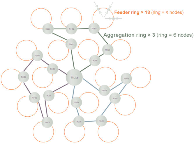
Figure 2: Aggregation rings connect local feeder rings in a metro-Ethernet network
If demand across all customers in the feeder rings is already estimated in terms
of aggregate connections, c, and peak bandwidth, d, then let’s focus on the dimensioning
of the interfaces to and fibres on the aggregation rings. To avoid the distraction
and unnecessary complexity of different port speeds, we shall assume that all fibres
are running at 10Gbit/s, and that we will work to a maximum utilisation of 60% to
avoid any undesirable packet loss due to unexpected surges in demand.
A switch or router device will be required to transition traffic to and from the
relevant aggregation ring from a given feeder ring and we shall assume that the
required 10G ports for this device are provisioned on 10-port line cards.
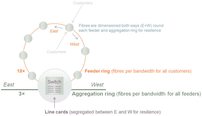
Figure 3: 10G ports provisioned on 10-port line cards at a feeder–aggregation interface node
Each 6Gbit/s of aggregate bandwidth from customers occupies the maximum desired
60% utilisation of a 10G circuit and will thus require:
- (2× 10G ring ports at each feeder node in a feeder ring, as well as the initial
access ports of varying speeds at the originating node – all outside the scope of
this article)
- one fibre around a feeder ring
- 2× 10G feeder ports on an interface switch
- one fibre around an aggregation ring (assuming everything runs at 10G)
- 2× 10G aggregation ports on each interface switch in an aggregation ring
- (2× 10G aggregation ports at the central hub, most likely on two distinct hub devices
for additional redundancy – also beyond the scope of this article).
This already presents an interesting ‘shopping list’ for a business model, and we
need first to understand how to allow for the geographical overhead mentioned above
before we can get into the real subtleties for which this article was intended.
Allowing for ‘just enough’ geography
If you were to attempt a simple multiplication and division to work out how many
fibres must be lit and line cards required, the aspects you might miss would be:
- a line card cannot be shared between two separate aggregation nodes
- surplus fibre capacity in one aggregation ring is not available to another ring.
Fortunately, our well-documented Monte-Carlo deployment model is designed to make
a pragmatic and realistic estimate of the additional overhead required due to the
demand, d, being spread over multiple rings and aggregation nodes. So in a STEM
model, we simply need to make the resources aware that they are spread over discrete
‘sites’, and then STEM will take care of the details. In simple terms, it will allow
for the fact that you would expect to have slack or under-utilised capacity at each
‘location’: on average, half a fibre in each ring, and half a line card at each
node.
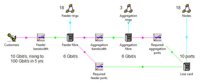
Figure 4: STEM factors-in a slack overhead according to the geographical distribution of demand
The increased results are shown in the second chart in Figure 5 below, and you may
note two separate effects:
- there are now at least as many units as there are discrete locations; e.g., at least
18 line cards (one per node)
- there is a sustained overhead in proportion to the number of nodes due to the fact
that there will continue to be a number of ports free at each separate node.
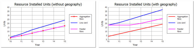
Figure 5: Installed units calculated, first without, and then with awareness of geography
An inconvenient but necessary real-life engineering principle
So far so good – until you consider how the mathematical resilience of the ring
translates into actual engineering. It is all very well having two ways around the
ring (E+W) to choose from, but this won’t help much if a line card fails and both
fibres are plugged into ports on the same card!
So an additional, engineering constraint is that the line cards at any given node
must be partitioned between East and West connections respectively. In effect, we
have 18 × 2 = 36 discrete ‘line-card sites’, which means at least 36 line cards
(two per node).
The same calculation structure more or less works, but it would be ignorant of the
fact that, at any given node, there will always be the same number of East and West
connections. So it is more accurate to change the ‘shopping list’ from the original
‘2× 10G aggregation ports at each node’ to ‘1 pair of separate ports at each node’.
This is almost identical on paper, but the revised logic would be as follows:
- work out how may port pairs you need (feeder fibres + aggregation fibres ×6)
- calculate the number of line-card pairs, allowing for geography
- multiply by 2 to get the number of actual line cards.
In other words, we are saying deploy matched line-card pairs at 18 sites as opposed
to fully independent line cards at 36 sites.
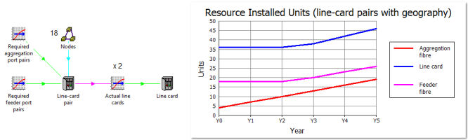
Figure 6: Line cards are deployed in pairs, with twice the overhead of slack ports
Live connection to the model
For the very first time, we present a live interface to the model*
where you can see directly what results it calculates for a variety of ring
and line-card configurations, and how the demand evolution impacts the
business value of the required investment. Try it! Just change some of the
inputs in Figure 7 below and then click ‘Run model’.
You should find that the Y5 demand assumption has a sweet spot around 0.5 Gbit/s if the
other parameters are unchanged.
Figure 7: A Flash object embedded in this web page runs the model on our server
* Of course what you are running is a copy of one particular version of the model
evolution described in the newsletter article. In order to maintain a separation
between different users connecting to the web service, a fresh copy is made and
run independently for each user. Note: as far as we know Flash
is not yet supported by 64-bit web browsers. On other browsers, you may need
to elect to ‘Allow blocked content’ if the plug-in does not load immediately.
Looking more carefully at the ‘tilt’
There is another more subtle homogeneity which we have so far overlooked, or at
least, not translated accurately into the model. Although there are 18 nodes, it
is not accurate to assume that the distribution is ‘tilted’ progressively across
all 18 of these; or, more specifically, that that the demand has a ‘continuous’
normal distribution across those 18 nodes as is implicit in our use of the Monte-Carlo
distribution.
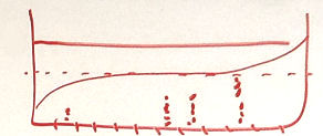
Figure 8: A normal distribution of demand ‘tilts’ around the average, with rather
more nodes having near average demand than those with greater variance from the mean
In contrast, the rings are dimensioned to handle the peak demand ‘either way round’,
with the effect that the demand carried by each link in a given ring is exactly
the same. There are the same numbers of fibres all the way round, and hence the
same number of ports required at each node. The only tilt we should allow for is
the variance of demand between the three aggregation rings. Rather than ‘1 pair
of separate ports at each node’, our ‘shopping list’ for each 6Gbit/s of aggregate
bandwidth now becomes ‘1 port in each of a dozen (twelve) separate line cards’,
where the only ‘geographical averaging’ relates to the proportion of customer demand
carried in each of the three aggregation rings.
The only complication is that we also need two ports at each node on the feeder
ring, and this aspect should continue to vary ‘continuously’ over all 18. However,
this effect is secondary as we have six times as many ports on the aggregation ring,
so it will be ‘good enough’ to fold this additional demand into the three-way variation
of the demand for separate dozens of line cards on each aggregation ring.
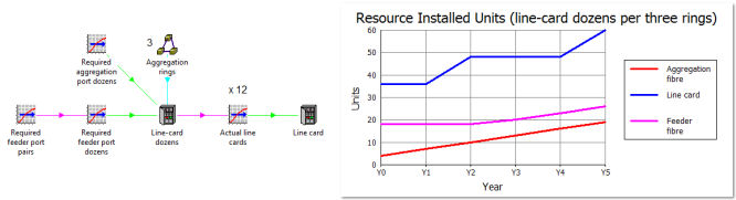
Figure 9: Line cards are deployed in dozens if the demand at each node is identical
You may notice that the results are more ‘lumpy’ because the count of line cards
now increases in dozens rather than in pairs, and that the final result is higher
because it is an aggregation of a smaller number of individually larger, rounded
up items. Arguably the small variation in the feeder is sufficient justification
to stick with the previous approach of averaging the demand across all 18 nodes
rather than in three groups of six identical nodes.
A technical problem with ‘maximum utilisation before deployment’
It is worth mentioning that the 60% maximum utilisation constraint (dimensioning
on the strength of not more than 6Gbit/s per 10G circuit) was modelled by setting
the fibre capacity directly to 6Gbit/s, rather than defining it as a nominal 10Gbit/s
qualified with a 60% maximum utilisation input. The latter option has been an integral
part of STEM’s calculations for a resource for many years, but the problem is that
the current design applies this constraint on the overall installation after
it has applied any deployment consideration (geographical averaging). In this particular
case, we need to apply the 60% first to calculate the number of required fibres
before adding the geographical overhead.
A simple solution uses a separate Equivalent feeder fibre resource with nominal
10Gbit/s capacity and 60% maximum utilisation to capture this effect first before
passing demand on to the real Feeder fibre resource which can be deployed over the
18 feeder rings.
However, as shown in Figure 10 below, you have to scale the output by the effective
utilisation to avoid over-provisioning if you use this to calculate the aggregation
fibres too. E.g., a feeder demand of 3Gbit/s requires one fibre in the feeder ring,
but only 50% of an effective fibre in the aggregation ring.
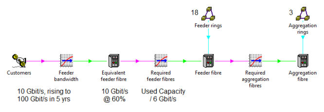
Figure 10: Allowing for maximum utilisation ahead of deployment
The alternative is to stick with bandwidth as the primary driver and repeat the
extra utilisation step for the Aggregation fibre resource too. Either way, we may
in future investigate the feasibility of making this alternative sequence of interpretation,
either a built-in option, or possibly even a revised behaviour. As it is, it would
be far from obvious without the benefit of the above discussion as to why it would
not ‘just work’.
Discussion with other expert practitioners
If you have had any difficulty following some of the more obscure details of this
article, then you may be pleased to hear that the concepts and techniques herein
described will be presented and discussed in detail at the STEM User Group Meeting
on 05–06 October 2011 at King’s College, Cambridge, UK. We will also take this opportunity
to get some feedback from the audience. We hope that you can join us!